This Is Not a Drill
Why the 2018 Hawaii False Missile Alert Was NOT a Failure of UX Design
It’s a classic UX horror story: In 2018, during testing of Hawaii’s missile alert system, an employee was confused by its poorly designed interface and chose the wrong option. The resultant alert was broadcast across the entire island causing terror, panic and confusion.
But, there’s a problem. It’s not true. In fact, the employee thought the threat was real. He deliberately succeeded in sending a live alert (despite the horrendous interface design). And, even worse, it wasn’t the first time this particular employee had confused fantasy and reality.
The Day of the Alert
According to the official investigation, here’s what happened:1
08:00
It’s morning at the Hawaii Emergency Management Agency (HI-EMA), and the warning officers are changing shift. The midnight shift supervisor tells the day shift supervisor that they plan to carry out a drill. However, the midnight shift supervisor doesn’t make it clear that the drill will occur during the shift change.
08:05
The midnight shift supervisor begins the drill, but the day shift supervisor is unaware and isn’t in place to oversee it.
The drill recording begins:
Exercise, exercise, exercise
But, against standard operating procedure, the recording also includes the fateful words:
This is not a drill!
The warning officer at the alert origination terminal believes that this is a real emergency.
08:06
The warning officer logs into the alert origination software and activates the “real-world Alert Code”.
08:07
The warning officer selects the live alert template from the drop-down menu. He receives a software prompt from the alert origination software:
Are you sure that you want to send this Alert?
He confirms.
A live incoming ballistic missile alert is transmitted to the State of Hawaii.
08:08
The shit hits the fan.
The official report concludes:
The primary human error was a failure to hear and/or properly understand the instructions indicating that the exercise was a test.
In an interview with NBC2, the employee responsible stated:
I was 100 percent sure that it was the right decision, that it was real.
User Error
Contrary to popular belief, then, it wasn't the interface, but flaws in the drill procedure that led to the error. But, it’s not entirely that simple. The employee in question had form.
The Hawaii state investigation revealed that the warning officer who issued the alert had been a concern for over ten years.3 The report finds that State Warning Point members considered him unfit for his position:
He is unable to comprehend the situation at hand and has confused real life events and drills on at least two separate occasions.
Hawaii News Now reported that, unsurprisingly, he was fired and thrown off the island.4
This is Not an Interface
So, we’ve cleared up one huge misconception about the event. The alert was sent on purpose by an unreliable employee. We had it all wrong. But that interface is still an abomination, right? Right!? We can all see how terrible the design of the alert origination software is at first glance.
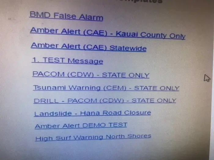
Indeed, countless articles have been devoted to deconstructing this muddled mess. However, there’s another problem. This wasn’t the actual interface. It was a mockup. And it wasn’t at all accurate.
Richard Rapoza, a HI-EMA press officer, explained:5
"The image (released to the press)... is incredibly confusing... There are too many different entries on it."
He added:
"This is my fault, because I'm supposed to be aware what goes on with our communications"
HI-EMA created the mockup as they didn’t want to reveal the exact software they were using due to security concerns. It was really just a selection of the type of warning options the system offered. Rapoza subsequently released a simpler mockup which he claimed was more representative of the actual interface:
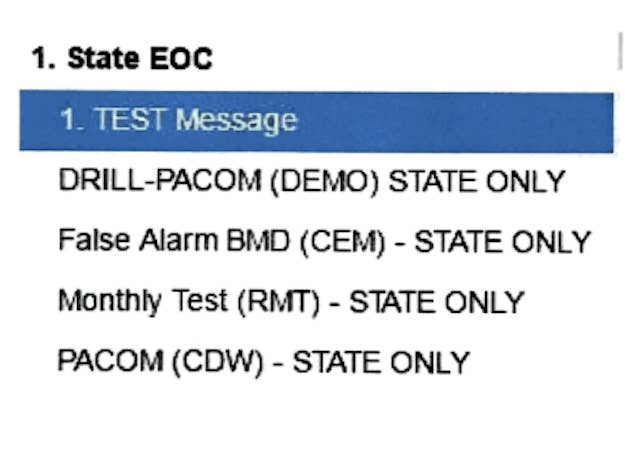
Note that the option, “False Alarm BMD (CEM) - STATE ONLY”, was only added in response to the botched drill. So, in reality, the warning officer had three options to choose from. Not quite the UX disaster we originally thought.
Learning Our Lesson
There’s no doubt that even the simpler design could be improved. But, the interface appears to have been the least of HI-EMA's worries. Faults occurred in procedures all the way along the chain. One of the only things that didn’t go wrong was an error in choosing the alert option!
The FCC report makes the following sensible recommendations:
- Conduct tests in a closed environment
- Require more than one person to validate the message
- Use specific language to differentiate between prompts for live alerts and test messages
- Limit employee permissions to create or modify drill messages
- Refrain from using phrases such as “This is Not a Drill” or “Real World” in test messages
It adds:
“test messages should be clearly identified as tests”
The suggestion that all messages are confirmed by two people is a good one — although it might not have caught this specific fault. That depends upon whether either of the operators caught the words at the beginning of the drill (“Exercise, Exercise, Exercise!”) or stopped to question the words, “This is not a drill". Certainly, the drill should not have used language reserved for an actual missile attack. Preventing employees from modifying the content of drill messages would have removed any doubt.
As for the prompt, It’s important to note that, contrary to the criticism of many UX commentators, there was a confirmation dialogue. However, the FCC report points out that: “The prompt contains the same message, irrespective of whether the message is a test or an alert, and it does not offer the officer an opportunity to review the message text that would be sent.”
Finally, once the erroneous alert was sent, it needed to be corrected as soon as possible. In reality, it took over half an hour.
According to WIRED6, this was because there was no automated process to send a correction and messages needed to be generated and sent manually. (The FCC investigation notes that HI-EMA subsequently created correction templates.)
The system was in chaos for almost 40 minutes, leading to headlines such as:
Hawaii Governor Couldn't Correct False Alarm Because He Didn't Know His Twitter Password
(Newsweek reports that the Governor has now saved his username and password to his phone. The status of his Facebook password is unknown.7)
WIRED also notes that the U.S. President or any federal agency with access to the Emergency Alert System could have sent a swift clarification. This they did not do.
Above all, the government should have prepared ordinary Hawaiians to act on a real threat. What made the failure all the more catastrophic is that panic broke out as a result of the alert. If there is an impending threat to your state that requires an emergency alert, tell your citizens what to do when they receive it.
WIRED reports that “during the wildfires in California... several counties declined to send alerts for fear of sowing panic, and instead, left their citizens wholly unprepared for the fires' spread.” The effectiveness of the alert system is immaterial if the delivery of the message causes a greater problem than it solves. It’s tempting to conclude that, if a ballistic missile is heading right for you, perhaps the smoothest user experience of all is not to know it’s coming.
The whole saga reveals a complex chain of preventable mistakes and human errors. And, in our rush to provide UX hot takes, we even got the critique of the incident wrong! Perhaps what we need to draw from this is that life is a messy business and there’s infinite variety to the ways human beings can balls things up, despite our best efforts and intentions. Who knows, perhaps I’ll find out tomorrow that everything I thought I knew about this story is wrong.
In the words of the employee who sent the alert:
“I regret this ever happened... I feel terrible about it. I did what I thought was right at the time.”
-
Federal Communications Commission, Report and Recommendations, Hawaii Emergency Management Agency January 13, 2018 False Alert ↩
-
Jacob Soboroff, Aarne Heikkila and Daniel Arkin — NBC News, Hawaii emergency management worker who sent false missile alert: I was '100 percent sure' it was real ↩
-
Brigadier General [Ret] Bruce E. Oliveira, False Ballistic Missile Alert Investigation for January 13, 2018 ↩
-
Hawaii News Now, 5 years ago today, a false missile alert threw Hawaii into a panic ↩
-
Jim Dalrymple II, Michelle Broder Van Dyke — Buzzfeed News, This Is The Button That Sent Hawaii's False Inbound Missile Alert ↩
-
Issie Laposky — WIRED, How Hawaii Could Have Sent a False Nuclear Alarm ↩
-
Ryan Sit — Newsweek, Hawaii Governor Couldn't Correct False Alarm Because He Didn't Know His Twitter Password ↩